Squad Pay
Squad makes it easy to collect both recurring and one-off payments directly from your customers' bank accounts.
Deliverables
- User Research
- User Experience Design
- Visual Design
- Usability Testing
- Strategy
- Interaction Design
Project Details
- Payment Gateway
- Duration : 5 months
- Platform : Web
- Client : Guaranty Trust Bank
Tools Used
- Sketch and Figma
- Miro
- Notion
- Google Forms
- Maze
- Confluence
What I did
- Guided the team on recruiting participants for usability testing.
- Collaborated with 3 other designers to design a system and all other visual designs.
- Moderated prototype test sessions
- Collaborated directly with UX Engineers, PMs, User Researchers and UX Designers to define study plan and make suggestions for prototypes.
- Conducted usability : Remote testing ( Maze ) and Contextual inquiry
Target Audience
- Individuals
- Business Owners
- Freelancers
- Kiosk traders, and anyone looking to make or accept payment.
What problems are we trying to solve here?
We realized that businesses [in Nigeria] still had to do a lot of work to accept payments. There are three big problems that we're solving. The first one is making sure it's very easy for businesses to get started.
The second big problem was helping businesses get paid. So, at Squad, we want to make sure that if somebody is trying to pay you, they can do that with ease. Right now, we're so confident that if a customer's card doesn't work on squad, it's never going to work anywhere else.
The third big problem is to provide merchants with additional tools like data, performance, and reconciliation as well as an inventory to manage their products. So, in a nutshell, we are building a product that helps businesses get started, get paid, and grow their businesses.
Solution
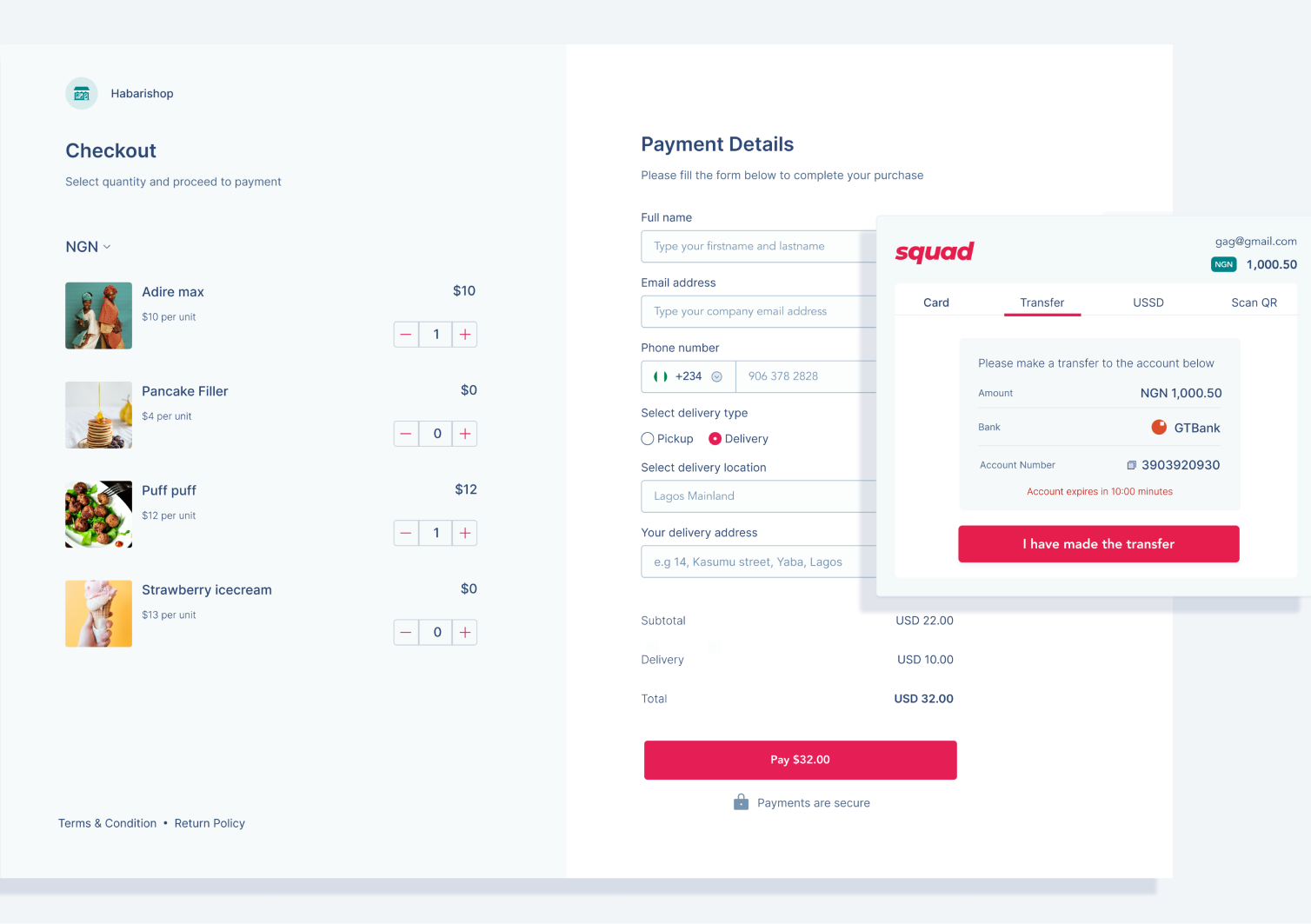
A payment gateway solution, an end-to-end payment aggregation suite for vendors, merchants, and business owners that enables them to create payment links and receive payment via USSD, Bank transfers, web, mobile, and POS channels.
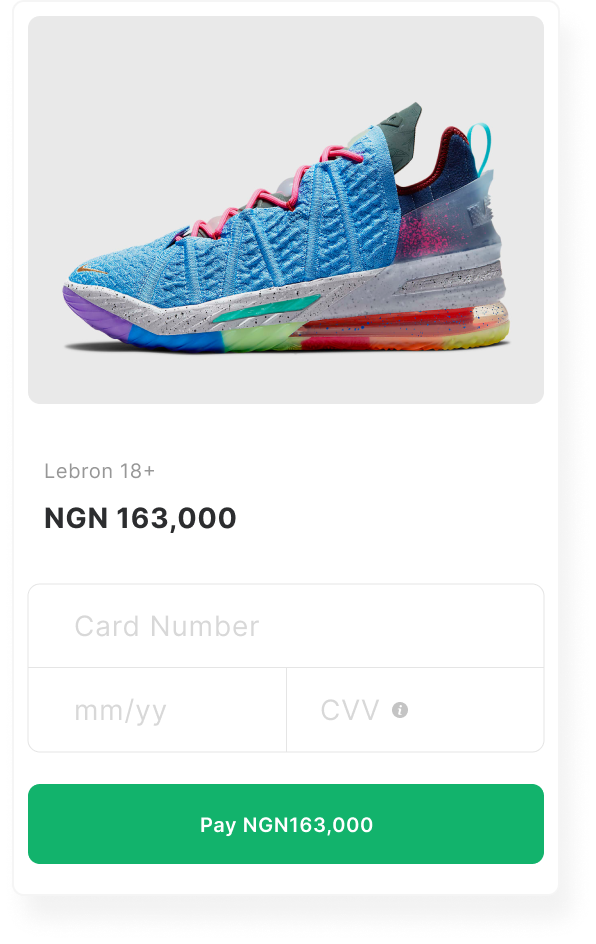
Create a payment links. Merchants can create Payment Links for online sales without a website
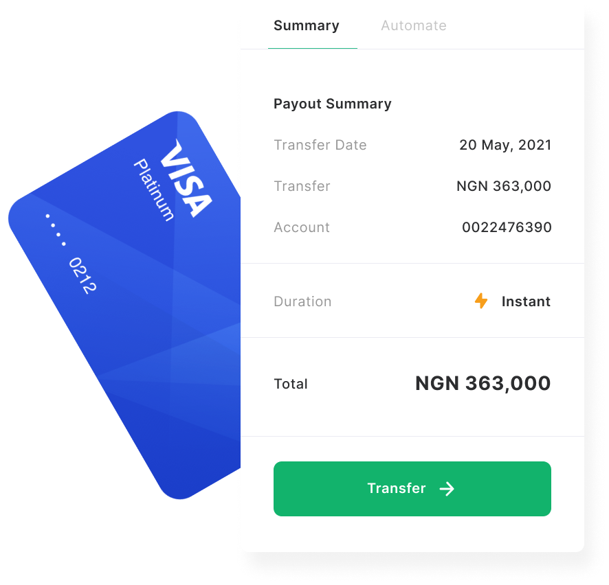
Transfer allows you to make transfers from the available balance in your squad account to your bank account.
We use advanced fraud detection tools to prevent fraudulent transactions and secure your shoppers data to avoid risks or blow backs to your business.
Get exclusive access to funds when you need it to meet up with your customers’ growing demands and pay back with a flexible plan that suits you.
Research and planning
In compliance with the non-disclosure agreement i signed. I have omitted sensitive date and obfuscated figures.
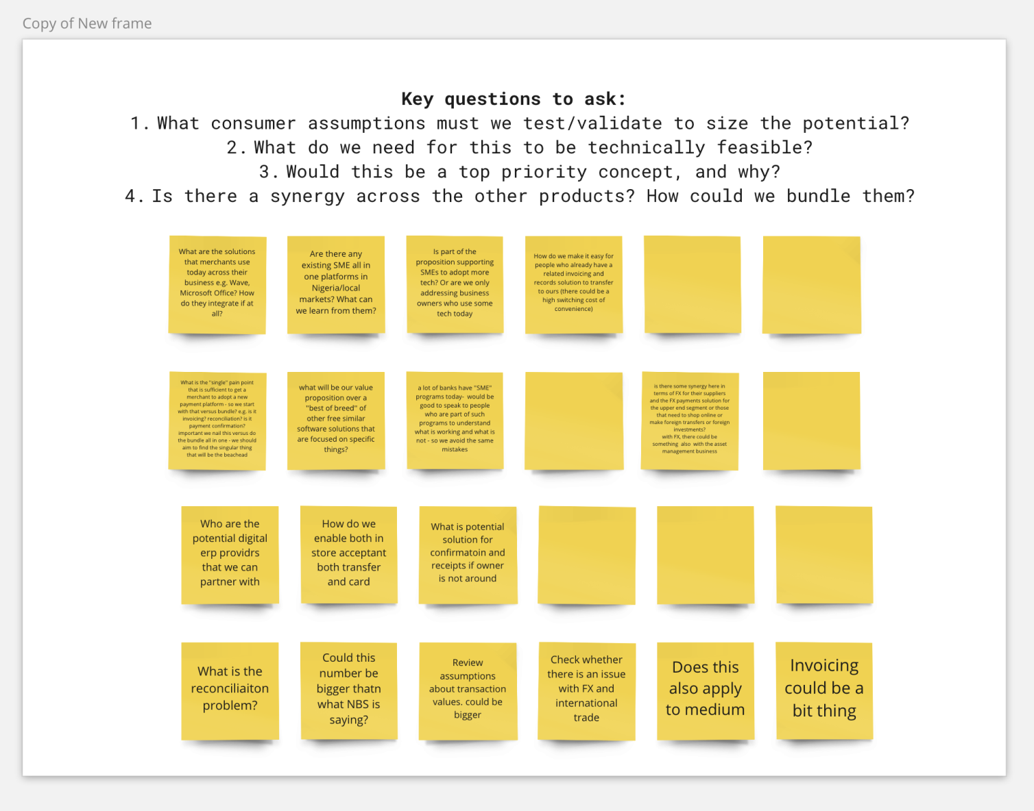
Research Data at a Glance
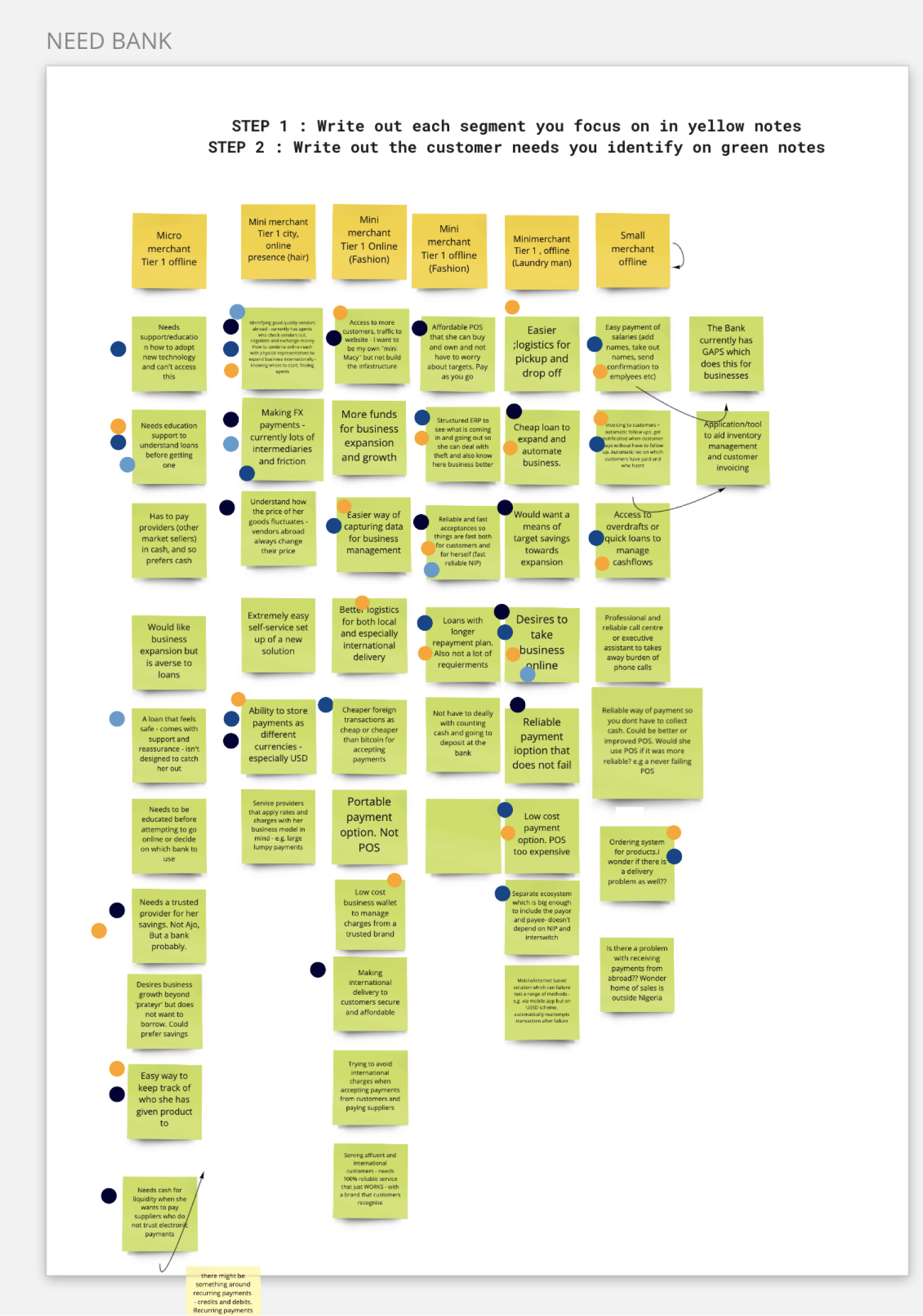
We had most of our research , brainstorm and analysis on Miro. As well as User personas drafting.
Indepth User Interviews
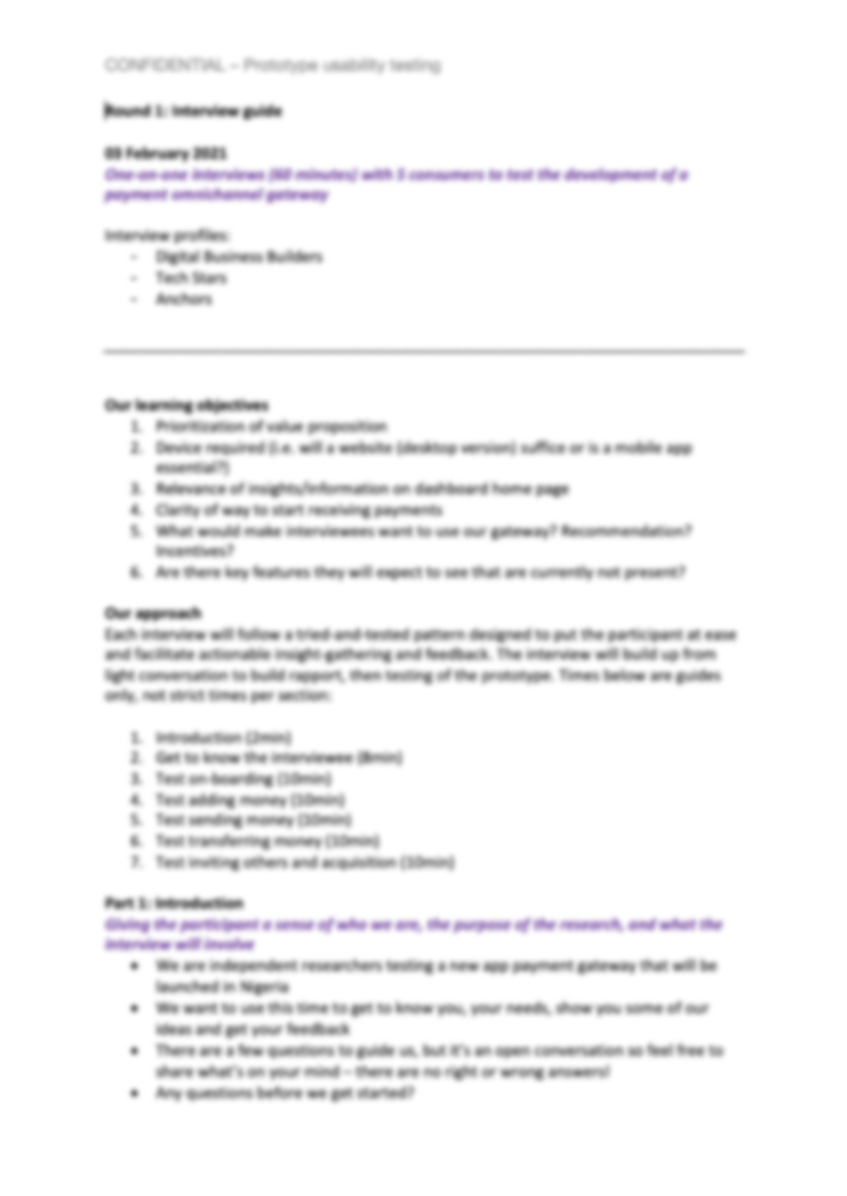
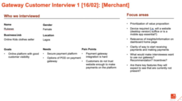
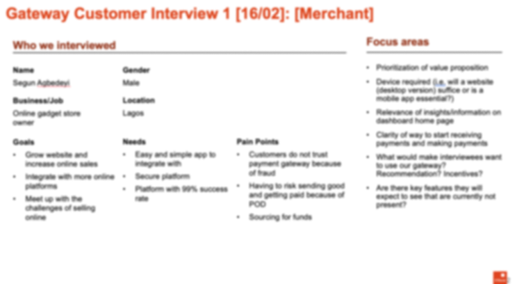
We also had an interview with some of our users to provide qualitative data about our target audience, such as their needs, motivations, wants, fear and behaviour. This would also help us understand what the app was lacking.
Here's a preview to the research guide to some of the interviews we had with our users.
Insights from User Interviews
Key Research Insights
- Online Payments are growing 2x faster; however offline payments continue to be dominant.
- Horizontal integration, customisabilty, Interoperability, and payment channel integrations are the key sucess factors that set leaders apart.
- There are five markets that could be considered as priority markets and that includes Nigeria, Tanzania, Kenya and Cote D'Ivoire
- Mobile wallets lead the way in most of the key markets, except Nigeria, where NIP is the largest and fastest growing channel.
User Personas
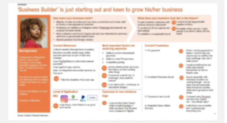
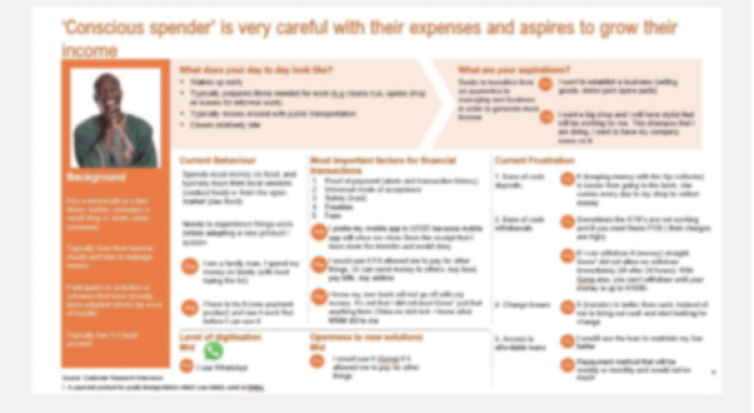
After I was able to identify key user groups, we created representative characters to help us understand users goal in specific contexts.
Empathy Mapping
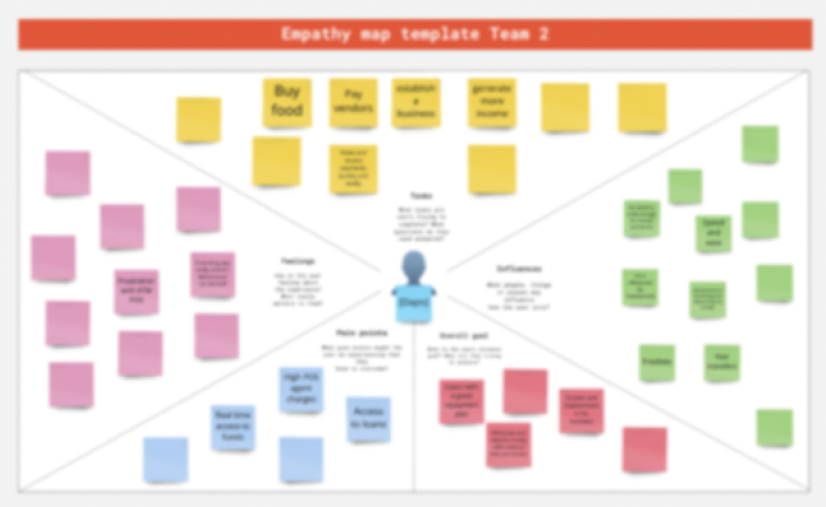
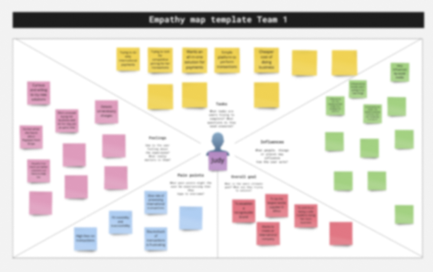
After devoloping the user persona, Empathy mapping helped a lot to identify the gaps between the user needs and current solutions. Empathy mapping helped us gain deeper insights of our user by putting us intheir shoes, Seeing things from their prespective and understanding the problem better.
Usability Sessions & Testing
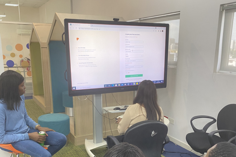
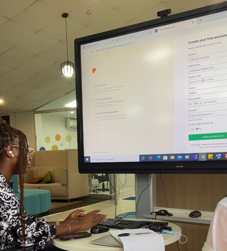
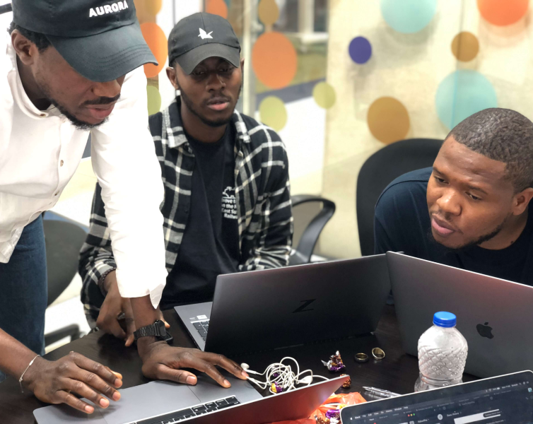
We carried out usability testing to test our initial ideas, the two methods we used were Contextual Inquiry and remote testing using maze. I helped recruit participant as well as creating prototypes on maze.
Key Metrics
- After a number of usability tests, iterations and useful feedbacks we eventually arrived at a satisfactory product. Our KPIs achieved are as follows
- Task success rate increased by 30% from 20%.
- User error state reduced by 60% from 40%.
- The average time-on-task was reduced by 40% from 20%.
- We maintained the conventional business model of most instagram merchant and automated some of their processes.
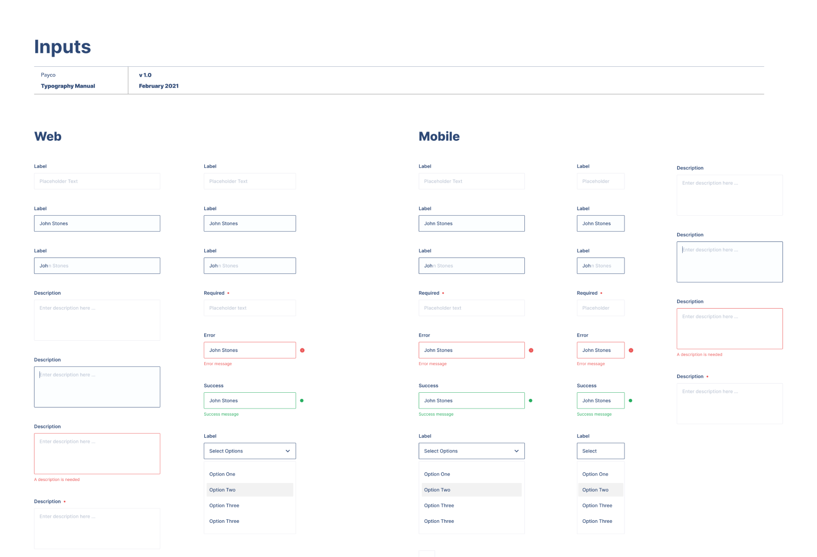
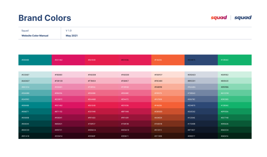
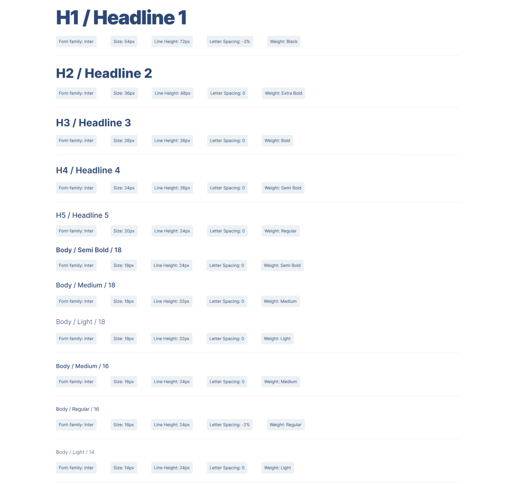
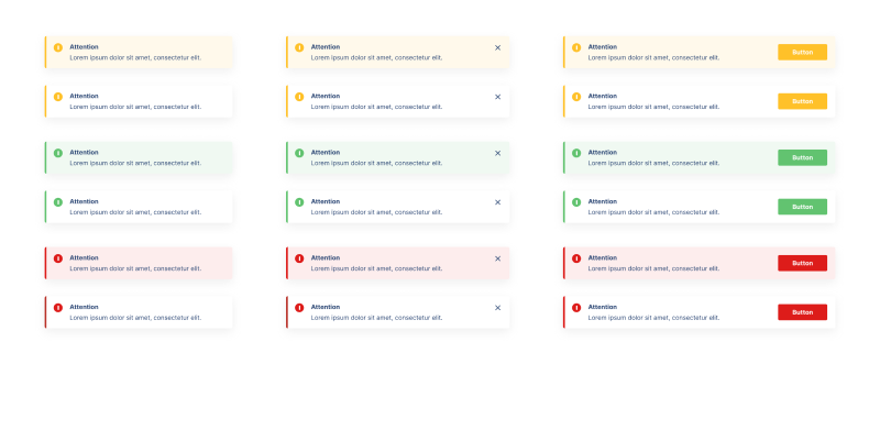
Design System
I Created a design system with the help of my teammates to come up with a design system, By utilizing a collection of repeatable components and a set of standards, guiding the use of those components,
Design
Now, it's time to put to use all our research data and ideas generated in the previous phase into tangible artifacts that can be tested later with real users.
It was time to digitize my sketches. I created the mid-fi prototype using Figma.. View more here
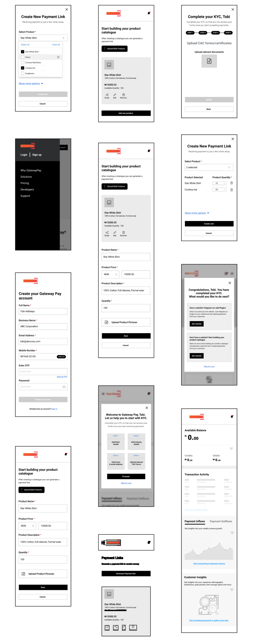
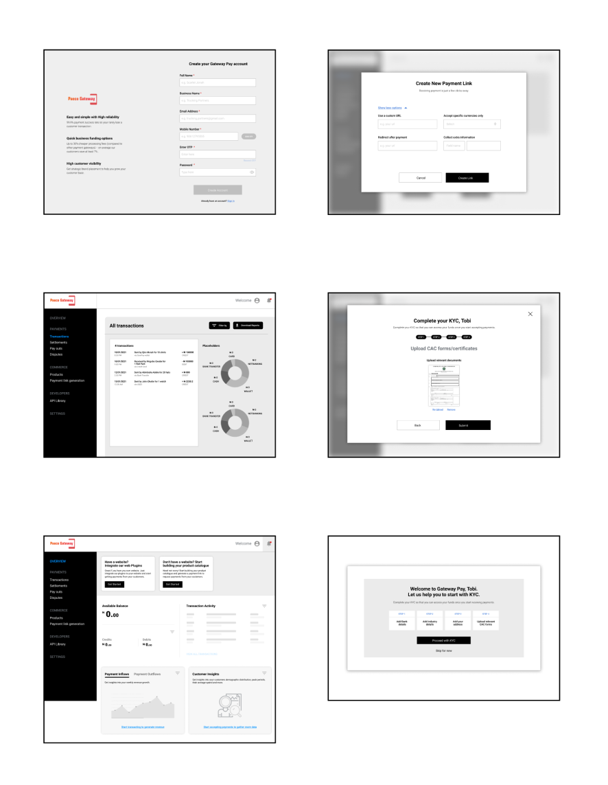
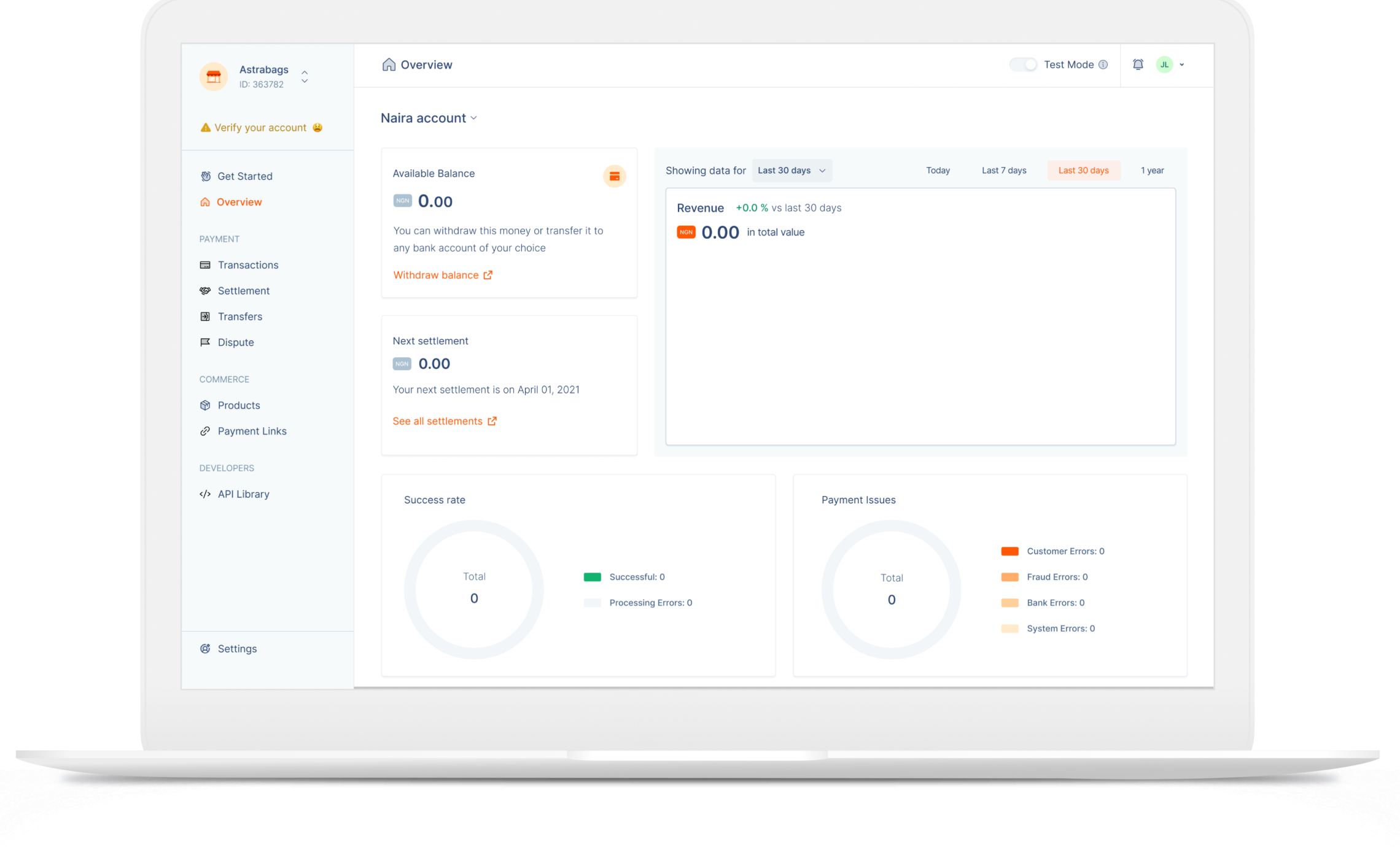
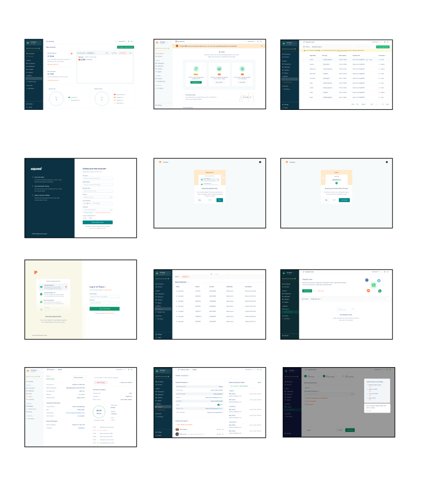
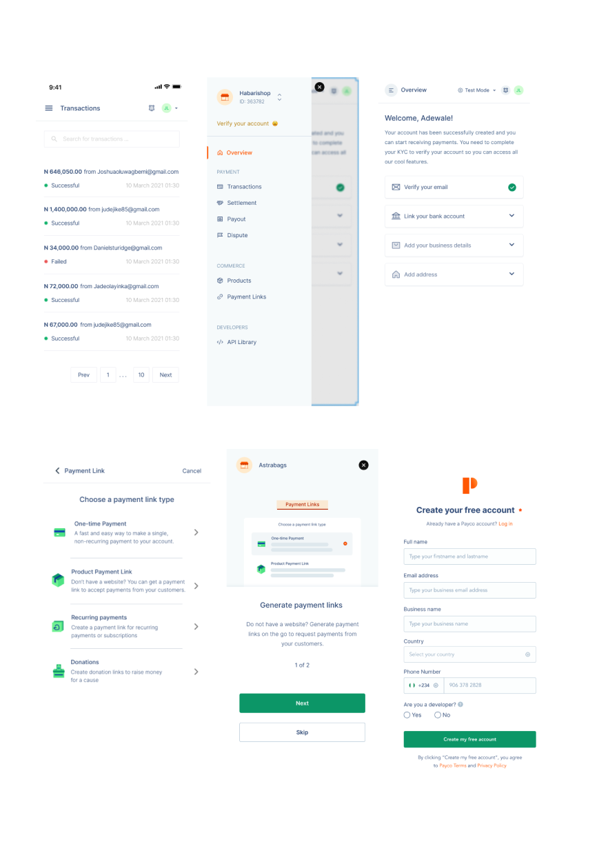
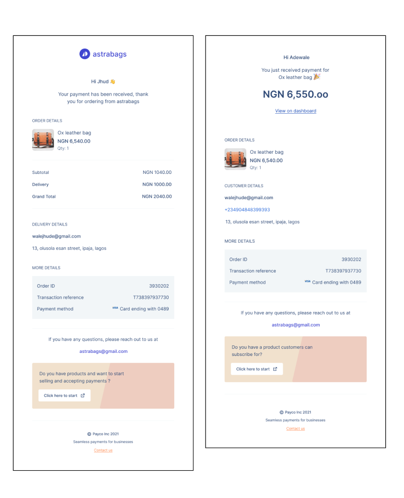
After I was done with the sketches and mid-fi wireframe, I started to work on my style guide as well creating a moodboard and finally firing up the designs, View some interactions here
UX Challenges, Learnings and Next Step
The scope of this project covers UX Research, Visual Design and Prototyping. I was faced by a few constraints while working on this project which includes the following;
- I had to schedule several online meetings with some of our potentials users to understand their goals but they were mostly too busy to attend or had internet issues.
- It's a big bank and there were a lot of stakeholder and people that had a say in the final product that led to a whole lot of Iterations.
- We also had issues around branding and naming which in turn affected the our design language because we had to work with a tentative one.
- It took a while for the design team to synchronise together. So I had to come up with our problem solving approach and design systems.
- We had communication gap with the developers with in turn affected implementation and production , integrating with Slack helped solve the problem to a good amount.
The best way to build a product is by testing with actual users, that way you can unlock a whole lot of insights and win a million dollar idea.
More features will be added in the future. Also would be joining the go to market team to come up with strategies for marketing.