Express Pharmacy
Express pharmacy is an online pharmacy, where drugs can easily be accessible and purchased by customers with clinical services. What distinguishes express pharmacy is that they not only provide varieties and availability of pharmaceutical products but also have an online consultation with an online doctor and get correct prescriptions for aliments.
Deliverables
- User Experience Design
- Visual Design
- Strategy
- Interaction Design
Project Details
- Healthcare
- Duration : 2 months
- Platform : Web
- Client : Express Pharmacy
Tools Used
- Sketch and Figma
- Miro
- Google Forms
- Google Sheet
The Problem
The task was to make buying medicine online easy. When you or your loved ones are sick the least you want to do is spend a lot of time buying medicines.
Online pharmacies helps in reducing many wrong practices being followed in offline pharmacies. E.g., you can just walk in a chemist shop and buy any medicine without a prescription. This poses a huge danger to public health as it leads to self-medication. No good online pharmacy will give you medicine without prescription, which ensures that no patient can take a medicine without doctor's prescription.
Online pharmacies educate the patients about uses, side effects, precautions, storage conditions of various medicines (either through their website or on request by a patient). Since all genuine online pharmacies hire qualified pharmacists, they are able to guide patients better than an offline pharmacies, where 70% of shops are being run by Non Pharmacists. Pharmacists are hardly to be seen in offline chemist shops.
You don't have to go to different chemist shops to buy medicines. Sometimes, doctor writes 7-8 medicines to a patient and some of those medicines are not available with local chemists. Online pharmacies provide you everything under one roof, so you don't have to go through the hassle of searching your medicines at different shops.
Problems we solved
- People couldn't buy products for themselves and loved ones in one place
- People did not get proper diagnosis of their sickness and self medicated
- The difficulties in speaking to a doctor without queuing up at a hospital
- Getting fake over the counter drugs
Solutions
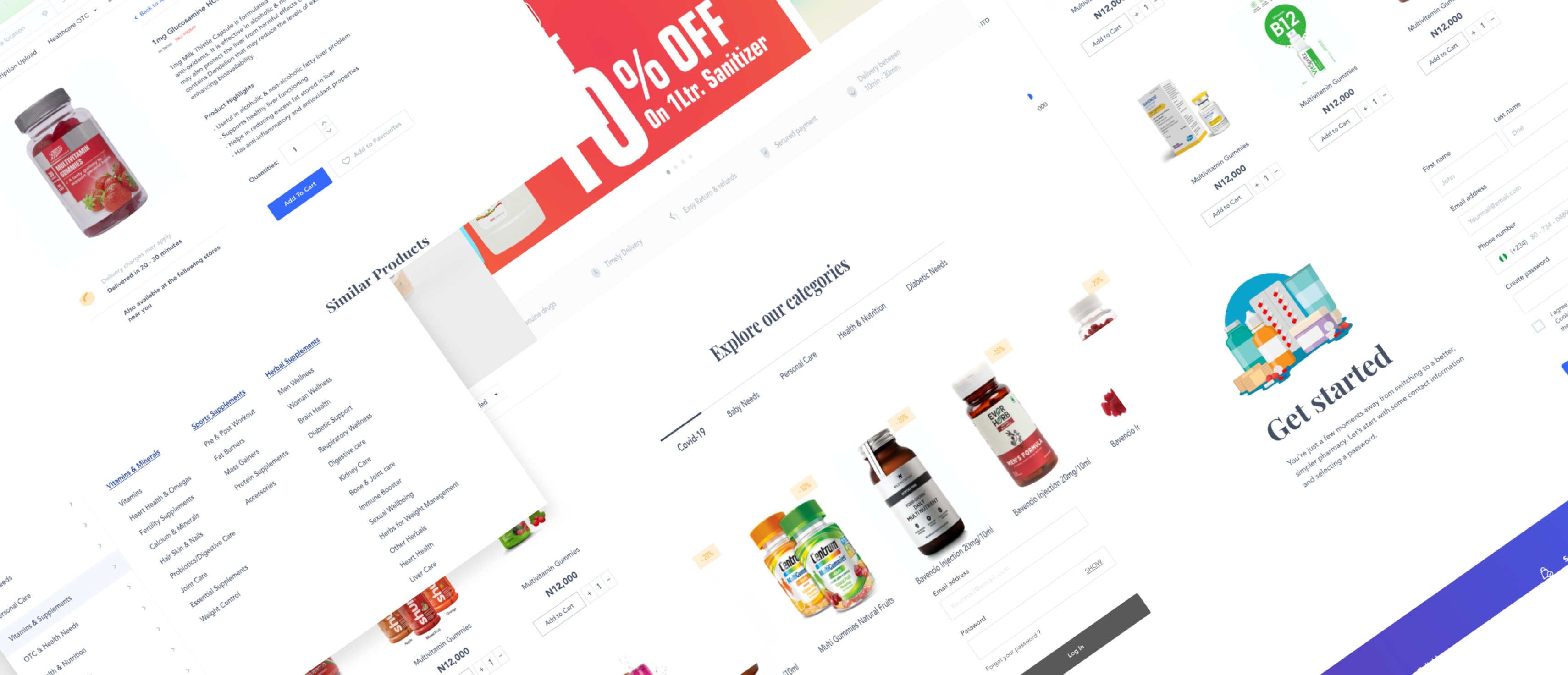
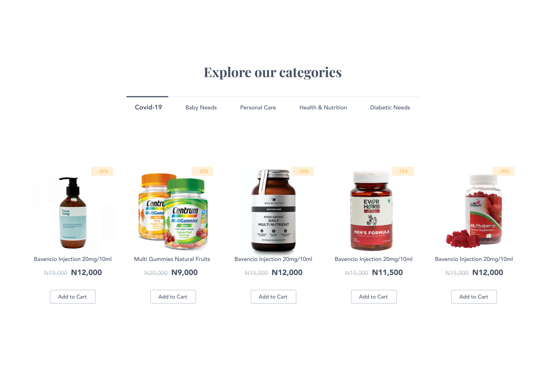
- We designed an online pharmacy where all kind ( Categories ) of drugs can easily be accessible and purchased.
- We also designed strong and easy communication between user and doctors. Do you need a prescription or proper diagnosis to your aliment, our doctors would help you find the right solution all in the comfort of your home.
- If you already have a prescription, thats not a problem, A user can send in their prescriptions and get their medications delivered to their preferred location.
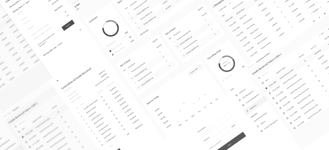
- We also. built a platform for store management where the store activities can be tracked and inventory managed.
Design Process
- Workshop
- Research or Discovery phase
- Defination
- Ideation
- Design
Workshop
The first step was interviewing stakeholders. That helped us understand their vision for the success of the project and their perspective on what the patients’ needs are.We also identified the goals and metrics for determining success. We chose technologies for the product and set up deadlines for each of the stages.
Research
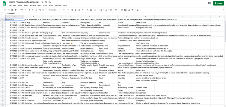
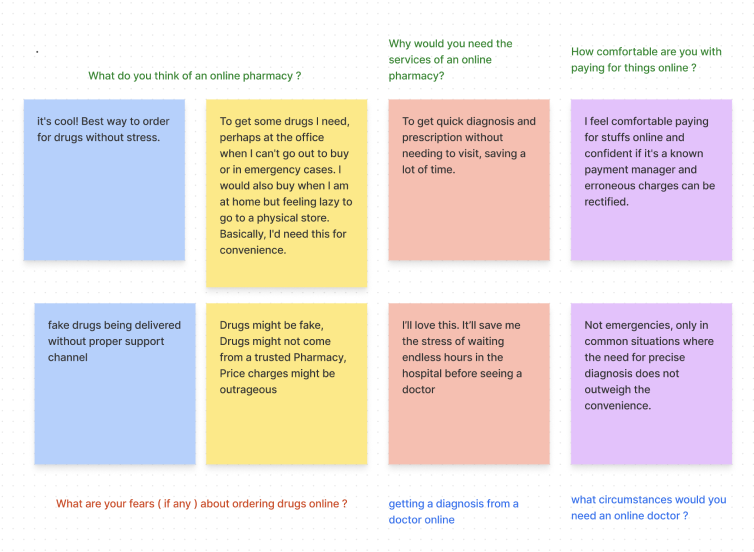
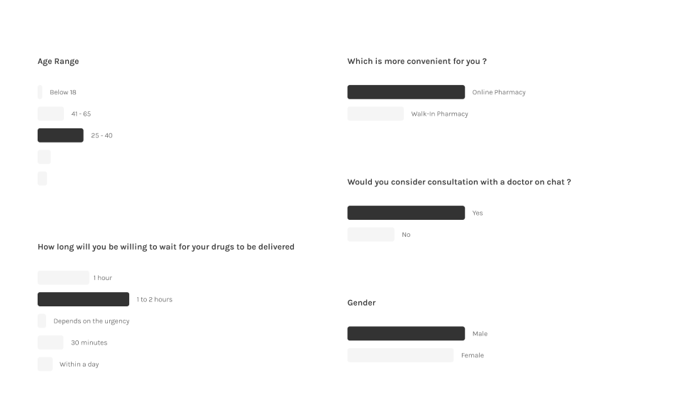
The goal of my research was to better understand user needs and frustrations with existing solutions in order to identify opportunities for the business based on existing products and to aid the development of new products. Two methods of research I used are Ethnographic research and Quantitative research methods.
Insight from research
The main takeaway from the research was that there is a mixed approach when purchasing medicines in Nigeria. A lot of people still prefer the walk in pharmacies as they feel seeing the drugs before purchasing them to ensures It's authenticity and they feel it’s cheaper compared to the online store. Many users think buying medicines from a local store is more convenient for them, but will be looking forward to buying online if the drugs aren't fake or expired and if the delivery is cheap, reliable and in time with insignificant delivery cost.
Competitors Analysis
To meet user's expectations, i analyzed competitor's websites Medplus, supermarket.ng , onehealth and drugstore and discovered most frequently occurring problems they have
- Long and unclear registration process
- Checking out as a guest ( without registration )
- Complicated interface
- The gap between payment and delivery
- Unavailability of some drugs
- Absence of consultation feature
- drugs are hard to find
- Order tracking and cancellation
- No refund policy
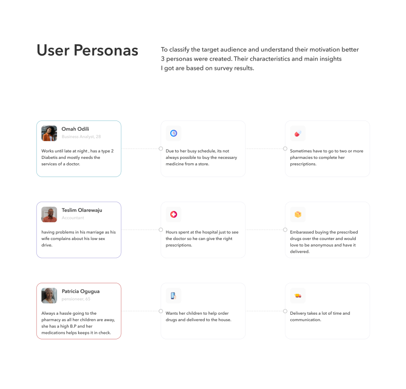
User Personas
After conducting user research and interviewed some users, I gathered all the findings to create a persona. This helps to understand user needs, goals frustrations and all.
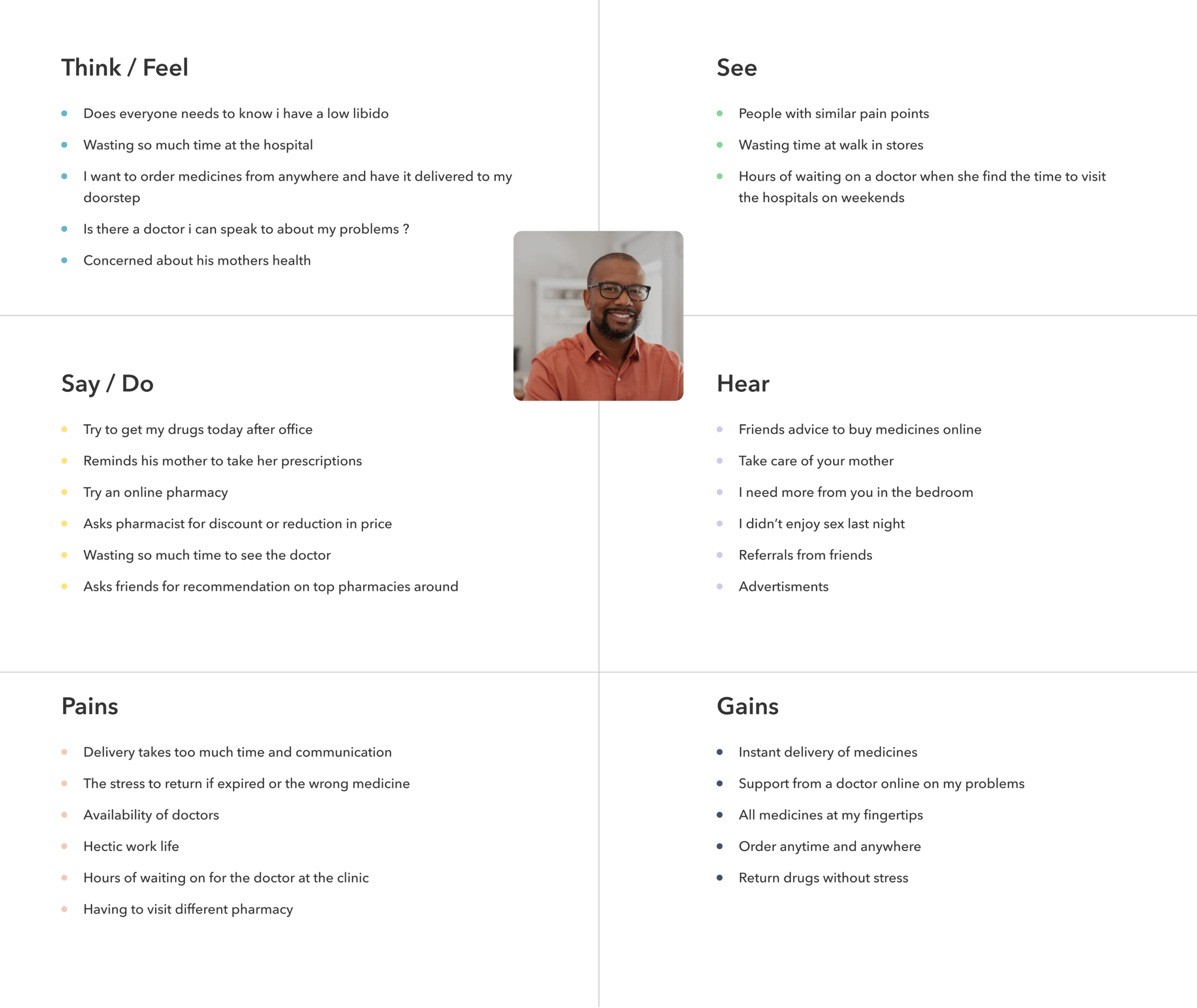
Empathy Mapping
Empathy mapping helps find more aps through the final persona. It helps to put the target audience feelings into perspective and gain deeper insights on users.
Scenario
Teslim is an Accountant in a top auditing firm and is busy round the clock, he barely has time for himself not to talk of his wife and his mother. His mum has high blood pressure and needs her drugs refilled and a medical checkup by a doctor every other week sometimes due to his busy schedule he forgets to buy drugs for his mother or even take her to the hospital. Also, his wife complains about his lack of attention and low sex drive and this causes a lot of controversies in their marriage.
His wife has insisted he visits a doctor for meditation but can't find the time to visit the doctor due to his busy schedule and sometimes gets embarrassed when he tries to get drugs at the pharmacy. A friend recently recommended a website to him, where drugs can be purchased and have it delivered anywhere and also have an online consultation with an online doctor and get correct prescriptions for aliments.
He quickly goes to the website and orders a drug for his mum, and also talks to a doctor about his low sex drive. Now he can order drugs and consult a doctor for himself and his mum from anywhere and have it delivered. This saves a lot of time for Teslim and he is very happy.
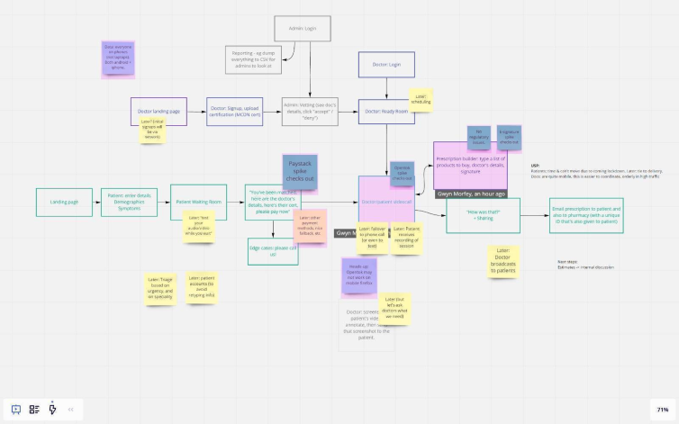
User flow from brainstorming session
The team had a session to anlyse findings and we came up with a flow, This flow helps us understand how users will navigate the appliication to complete a specific task and how to use the features proferred to achieve their goal or complete tasks.
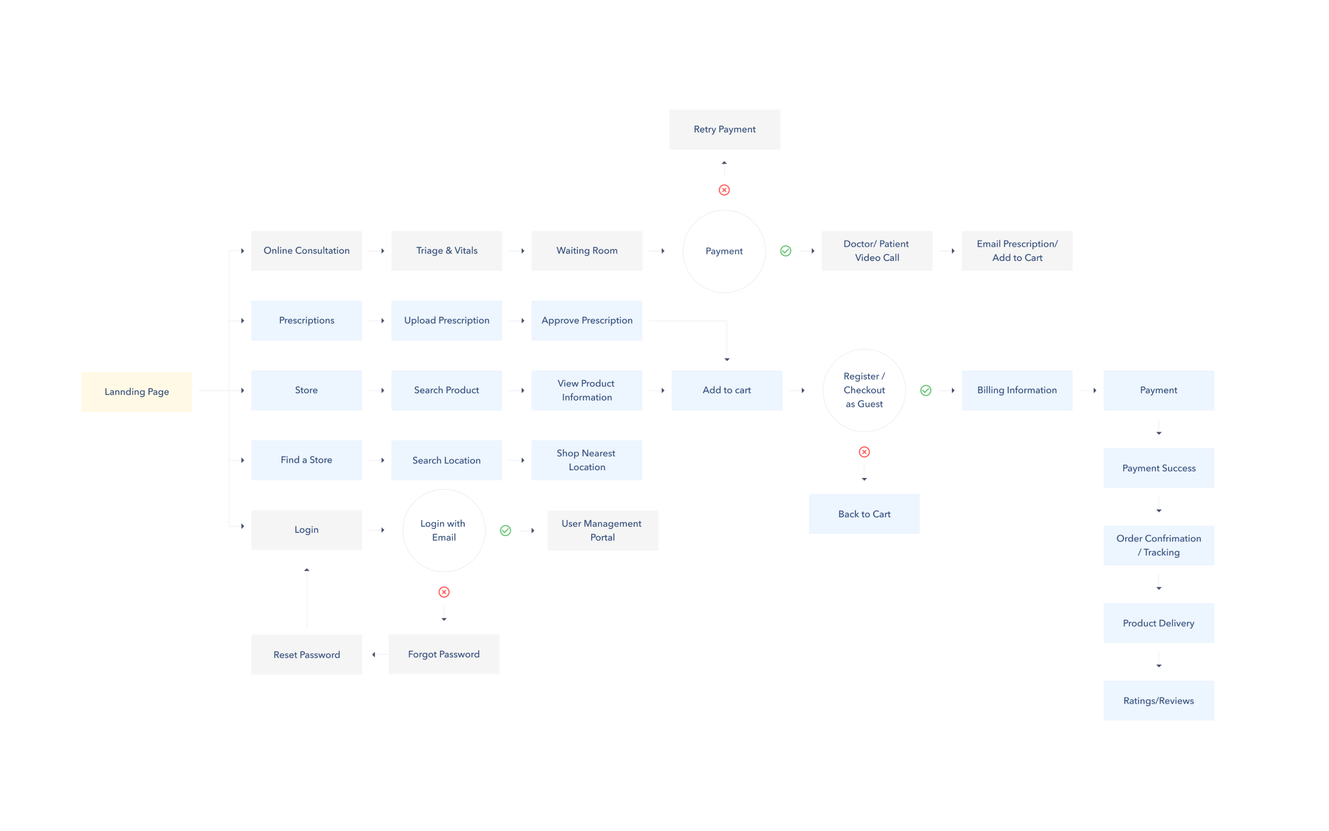
Sitemap
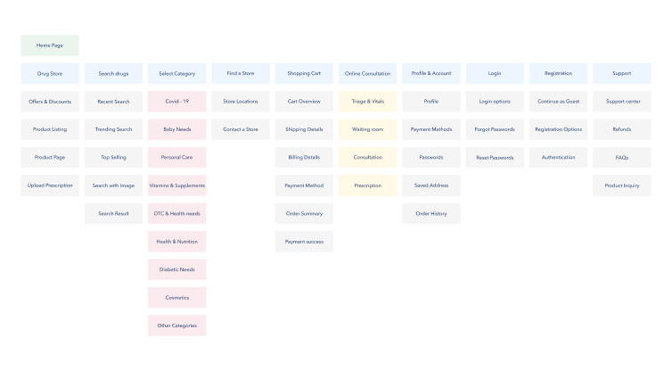
We created a site map to organize our contents so users would easily adjust to the functionalities and everything would be easy to find with less effort.
Sketches
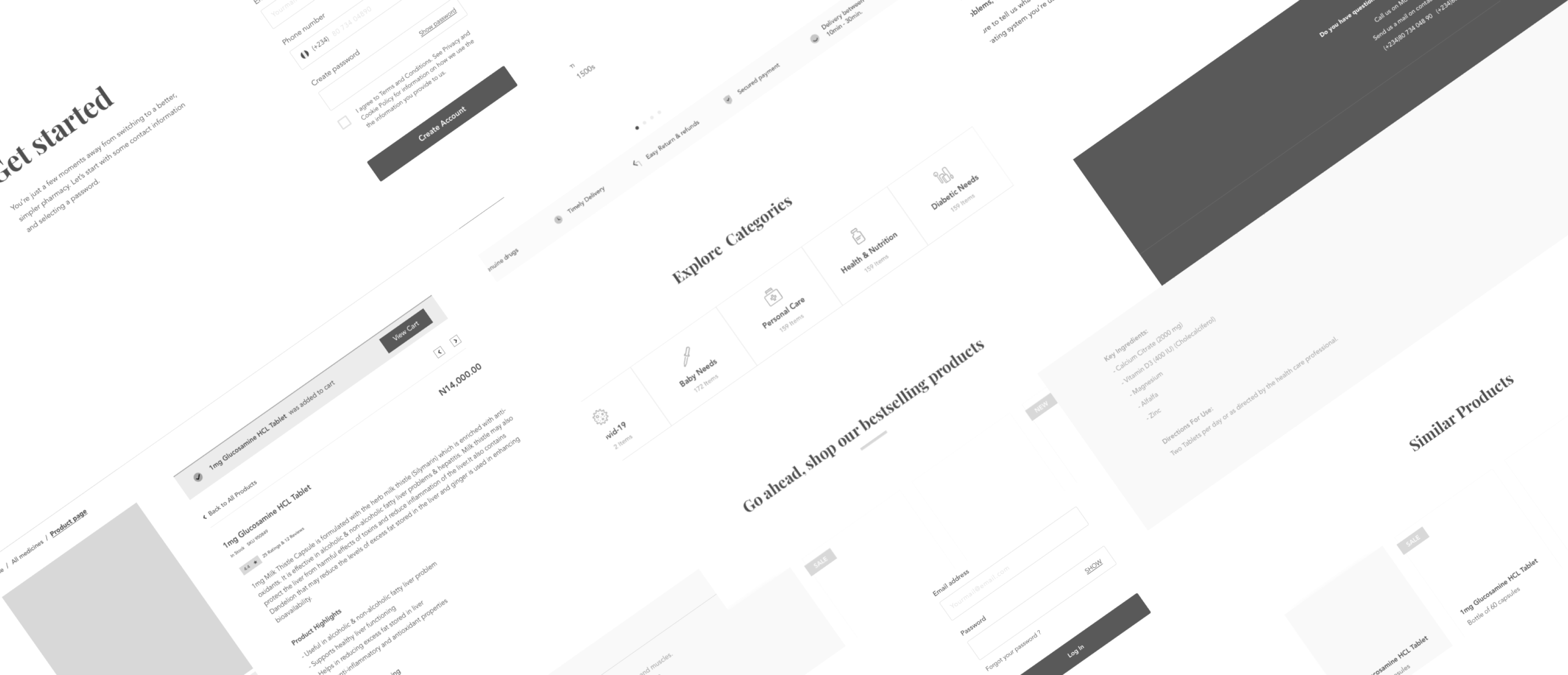
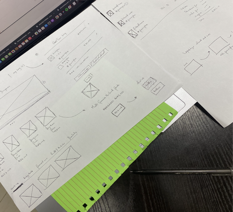
I sketched out ideas on a paper just to have bacis placement and layout. I didn’t create much of this though, once i got the ideas needed, I started Implementing low fidelity wireframes ( I like my wireframes to be high level as possible so it would be easy to convert.) Once client reviewed and approved i converted my Lo-Fi’s to high fidelity. I used Sketch for both Low and High Wireframes.
My Cart ( Bag )
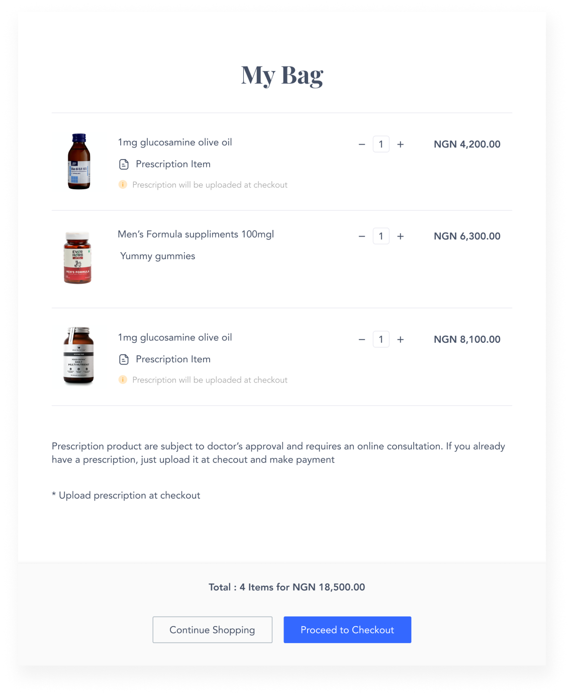
The cart is neatly designed and strategically positioned, it should be easy and fast to open.
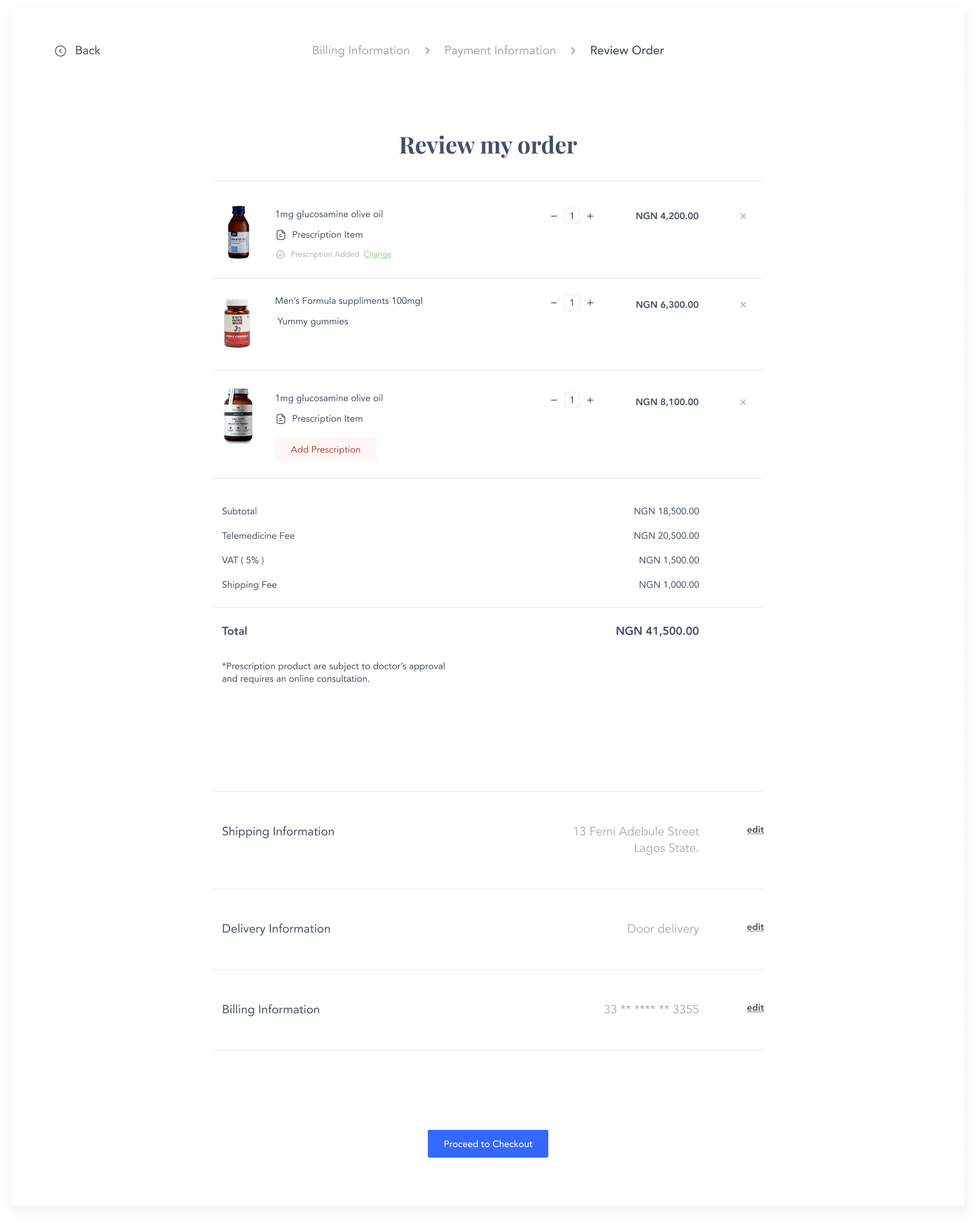
Drugs are added to cart wether they require prescription or not. Adding prescription and other information required happens on the checkout page.
Checkout
Adding prescriptions happens at this stage, you can add an existing prescription photo, if the patient needs a prescription, they can start an online visit with our doctors and get it, which happens after payment. you cant checkout successfuly if you fail to uplaod prescriptions for medications that need prescriptions
Usability Testing
We conducted usability testing sessions on our designs, in-person testing sessions, we had earlier scheduled dates with them and met them at their chosen location as to make sure they were comfortable. We had user stories of features and we watched how they interacted with the prototypes. We observed and analyze body language and facial expressions of users too.
Feedback
- Overall Layout was clean
- Navigation was easy
- Uses like the checkout as guest option
- Account creation wasn’t tedious
- Users struggled with entering their location ( helps to filter results to pharmacy around )
- Users needed categories to be filtered by brands.
- Users wanted to pay on delivery
What did I learn
- The client made it extremely difficult for us as they had new ideas almost every meeting, Their response was late and it slowed down things a bit, on one occation it took them a week to respond and wanted corrections implemented almost immediately.
- The timeline on this project was very slim and stakeholders wanted to skip research.
- I learnt how to work with difficult clients who would call you at odd hours and on weekends.
- Conducting interviews was hard as some users made us wait, some had to rescheduled, some didn’t pick up on the day of interviews etc.
- Next time i would have a moderator for note taking so i can concentrate on their opinions and expressions without missing any important details.
